What it is
"Evolution in the Flesh: The Finch Story" is a linear, interactive data story for a general reader, built from Peter and Rosemary Grant's 40-year study of finches on Daphne Major and their two books, The Beak of the Finch and 40 Years of Evolution. It runs on a clickable timeline from 20,000 years ago to 2012 and rebuilds four of the study's figures for someone with school-level biology. I made it as my pre-thesis project at IDC, IIT Bombay, between August and December 2020, guided by Prof. Venkatesh Rajamanickam under his "Data Visualization for public understanding of Science" umbrella, in Figma with Flourish charts, at 1440×800.
Source
Two books, one dataset82 files on Dryad, 16 chapters
When
Aug to Dec 2020Report declared 23 Dec 2020
My role
Sole designerHand illustrations by Sukanya Nirmal
Output
Web data storyLinear, navigable timeline, four redesigned charts
Tested with
2 readers, about 6 observedFormal pre/post test planned, not run
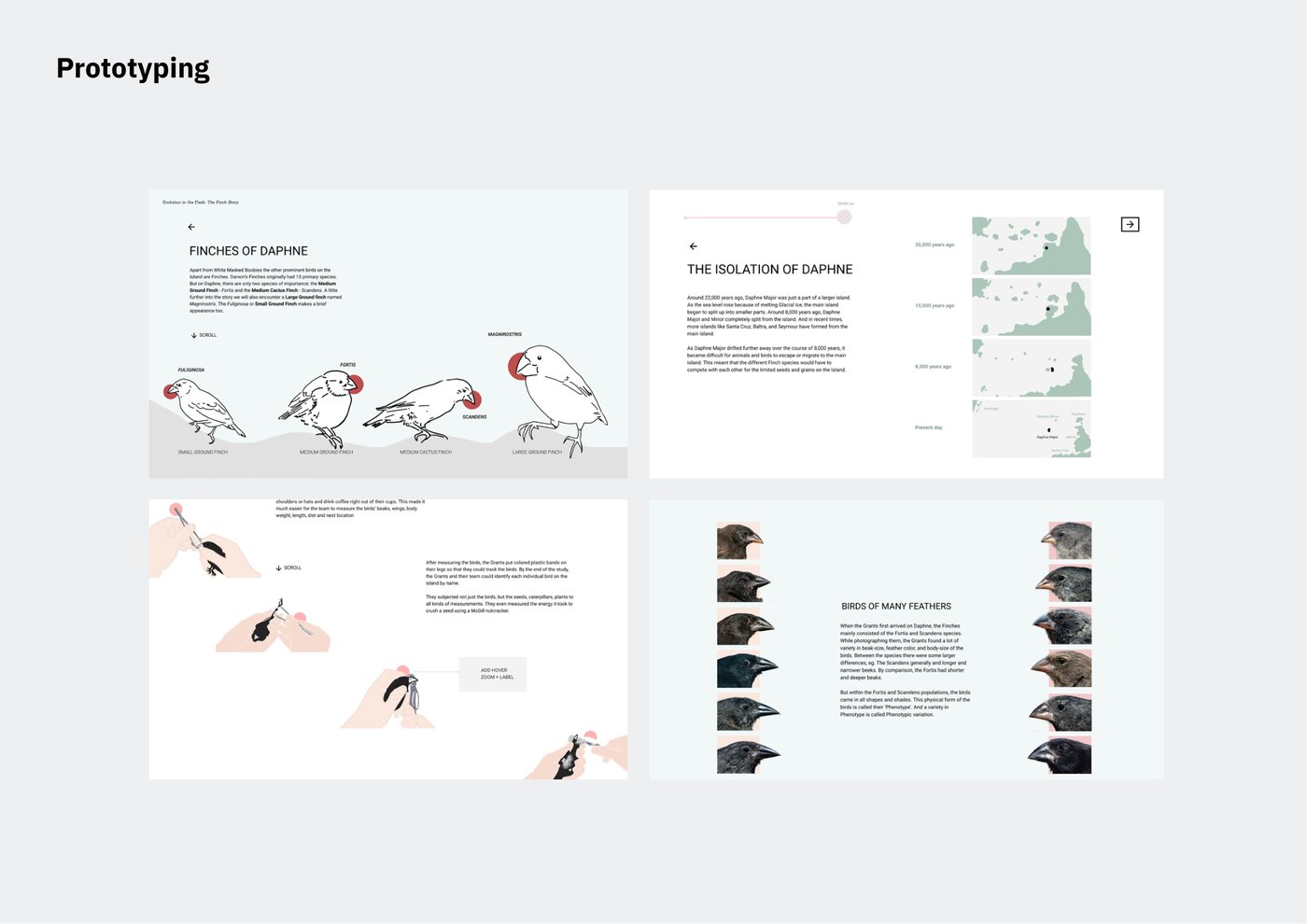
Four of the final screens.
The frame
Objective
Communicate the study's key insights to a general, interested audience, effectively and engagingly, using its own data and concepts.
Non-goals
Novelty of the visualisations, set as second priority from the start. Augmenting or redesigning the original scientific figures. The genetics chapters, which I scoped out because I could not carry them accurately.
Positioning
A gateway to the books, not a replacement. That scoping decision is what made the content cuts possible.
Evaluation criteria, set before the work
1. Clarity of the final output, concepts and visualisations. 2. Exploration and understanding of the subject (data visualisation) and the domain (the study). 3. The design process followed. 4. Aesthetic usability of the output.
Decision 1: Translate, don't invent
When the Phase 1 jury said the planned outcome was "very ordinary and not designerly" and asked whether the project's contribution was translation or novelty, I answered translation, and held to it.
What was at stake
The study was chosen because it clears up misconceptions about evolution. A novel output that compromised the translation would defeat the reason for choosing it.
The evidence
My own gap analysis of the books for a general reader: too dense, too verbal, not dynamic, no layering, low in experience. None of those gaps is closed by a new idiom. All of them are closed by translation.
What I gave up
Three ideas I had on the table: a cellular-automata pattern that evolves on its own, data sound art, and a "DIY: evolve your own species" simulator. Also a fictional narrator a juror suggested, because fiction would blur fact and story in a piece about correcting misconceptions.
What it produced
A narrative intent, argued against the alternatives: instructive explanations would demand a learning curve and an accuracy I could not guarantee; explorative needs familiarity the audience lacks; simulation needs predictive models and risks being wrong. Framework: Nichani and Rajamanickam's four intents.
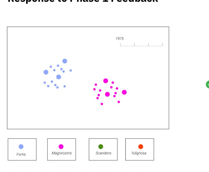
The simulator, set aside.
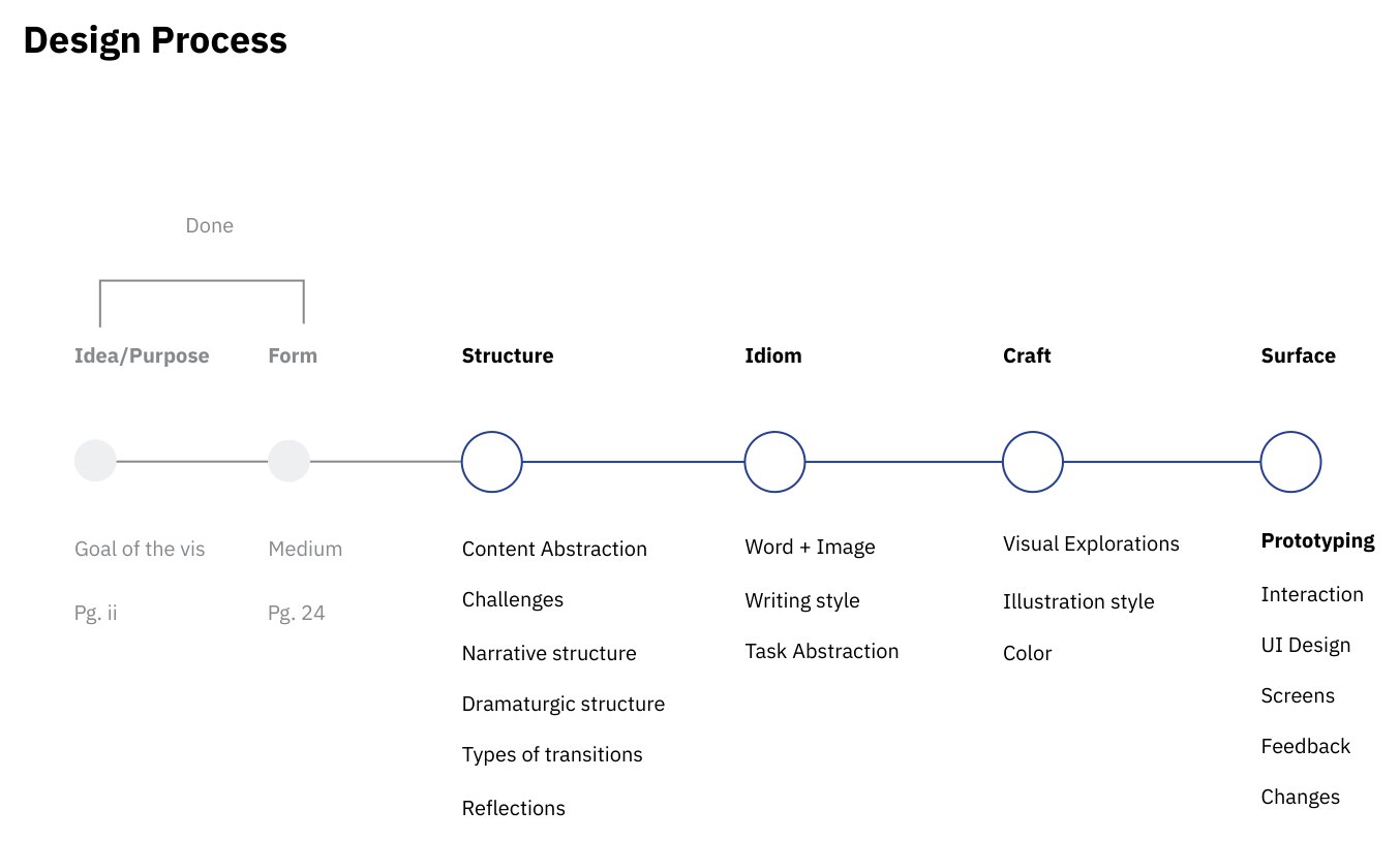
The process adopted instead: Scott McCloud's six steps for comics, re-appropriated for a data story.
Decision 2: Work from the data, not the sketch
I started ideating while still reading, and the sketches were purely visual ideas with no relationship to the data. I reversed the order, and the reversal caught a mistake before it shipped.
What was at stake
Scientific accuracy. A chart that looks better and means something different is worse than the original.
The evidence
Bigelow, Drucker, Fisher and Meyer's finding that designers default to visual-first over data-first, and Munzner's what/why/how framework. My first "improved" chart superimposed three series with different attribute types on a log scale, which changed the meaning of the data.
What I gave up
The visual ideas I had already drawn, and the assumption that a designer's job starts at "design".
What it produced
A working order for every figure: classify the data, find its shape in Tableau, choose the idiom, then design. Every redesign below came through it.
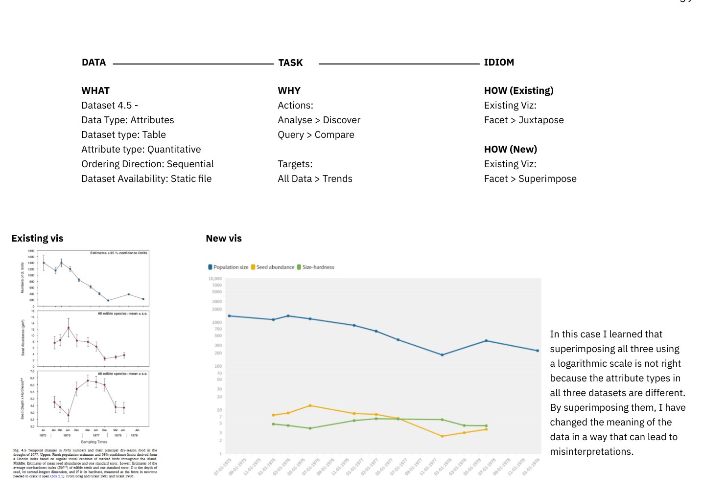
The worked example, mistake included. "By superimposing them, I have changed the meaning of the data in a way that can lead to misinterpretations."
Decision 3: Let the timeline carry the science
Abstracting the content raised four problems that my Phase 1 narrative arc did not solve. One timeline, from 20,000 years ago to 2012, solved all four, so I made it the spine of the piece.
What was at stake
Telling The Beak of the Finch's story with 40 Years of Evolution's data, for readers at different depths, without oversimplifying.
The evidence
Interdependent concepts (fortis are smaller today because fuliginosa went extinct 15,000 years ago); simultaneous events (magnirostris starts breeding in 1983, the year fortis numbers jump); complexity that generalising destroys; readers with different knowledge.
What I gave up
The hybrid linear and non-linear structure I had explored, and the concept cards reachable from anywhere. Switching between the two modes turned out to be harder than it looked and beyond one semester. The story went fully linear.
What it produced
Earlier events stay visible as notes the story points back to; simultaneity is seen, not explained; detail survives as passing mentions; the timeline is the overview and the text below it is the depth. And the medium carries the message: 20,000 years to 2012 on one line shows that evolution is visible in short spans.
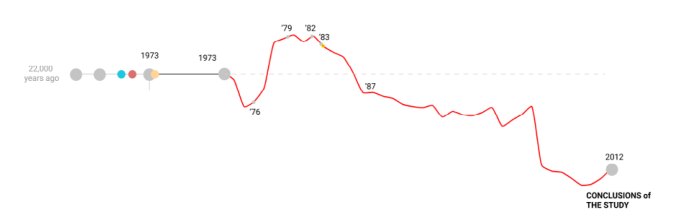
Deep time on the left, then the fortis beak-depth line itself becomes the timeline from 1973 to 2012.
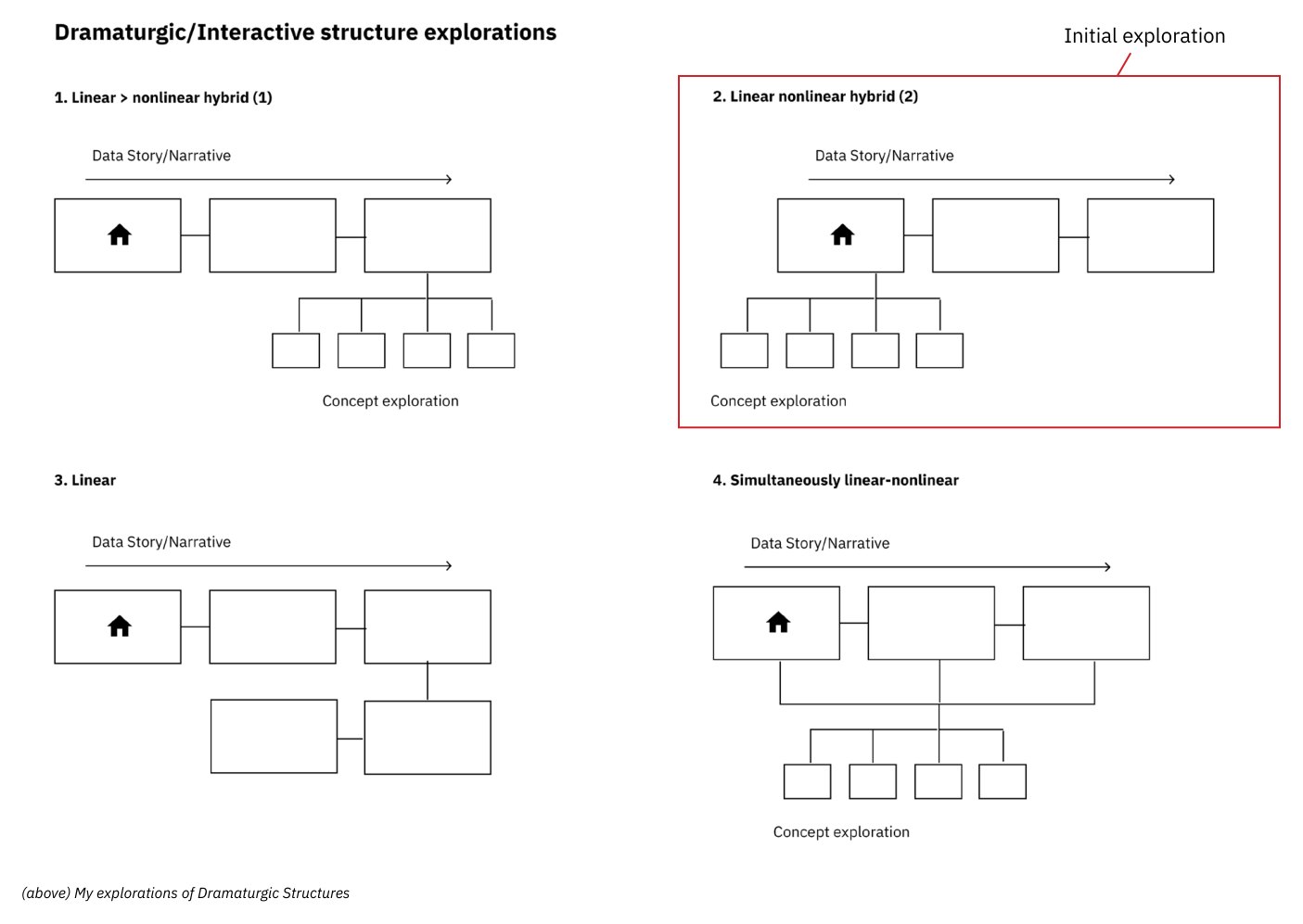
The four structures explored in Phase 1. The second hybrid was the initial direction; the linear one shipped.
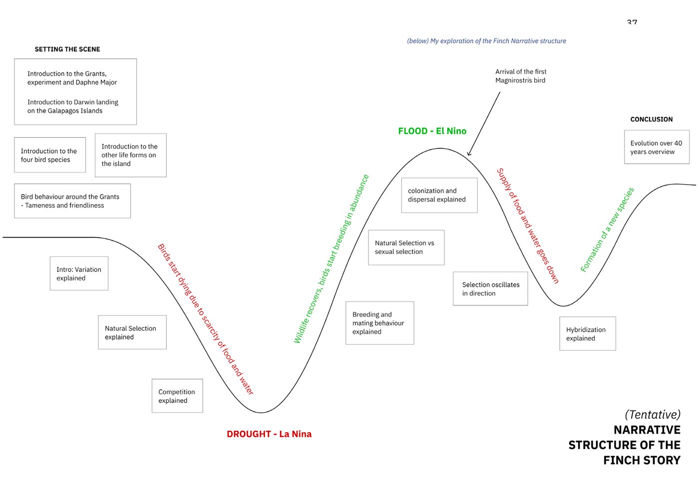
The Phase 1 arc, built from rhetoric (Engell) and long-form journalism (Gladwell, Gawande). Right shape, wrong spine: it could not hold the interdependencies.
Two smaller calls followed from the timeline. Transitions are event-to-event, McCloud's scene-to-scene made precise. And word and image are additive throughout: the visual leads, the text amplifies, and the relationship never changes, so the reader never has to re-learn it. Prof. Jayesh Pillai pointed me to Pudding.cool's "The Structure of Stand-up Comedy" and Alexander Perrin's "Short Trip" as the references for a linear read.
Decision 4: Redesign for the reader I had, and write like it
Four figures from the technical book were rebuilt with a stated goal each, and the prose was rewritten by three rules.
What was at stake
The figures were made for practitioners. A general reader needs to see one thing per chart and to be able to read the sentence beside it.
The evidence
The gap analysis, and the first two readers: one found the text jargon-heavy and hard to follow; the other wanted it shorter.
What I gave up
Precision the reader would not use: density ellipses, pedigree notation, three stacked axes. And vocabulary: "reproductive preferences" became "how they choose to reproduce"; "heritable variation" became "some characteristics could be inherited more easily than others".
What it produced
Four charts with one job each, a colour system from the story's three characters (finches, seeds, rainfall), and three deliberate kinds of image placed on McCloud's picture plane: abstract data, hand-drawn illustration, iconic diagram.
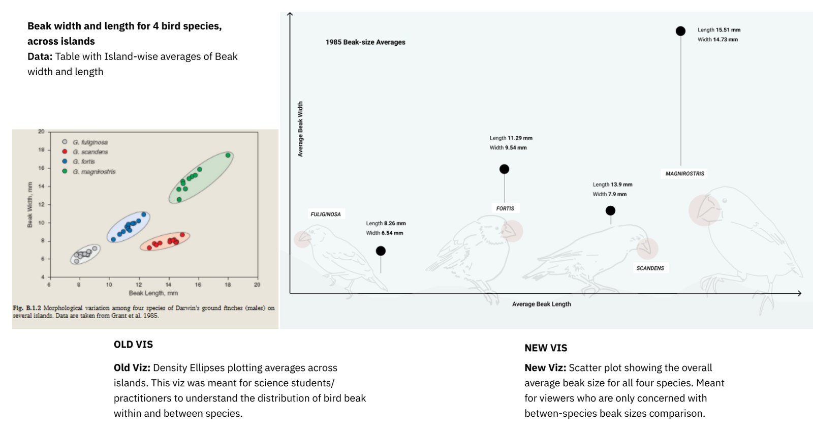
Beak size, four species. Old: density ellipses for practitioners. New: four averages a reader can compare between species, and nothing else.
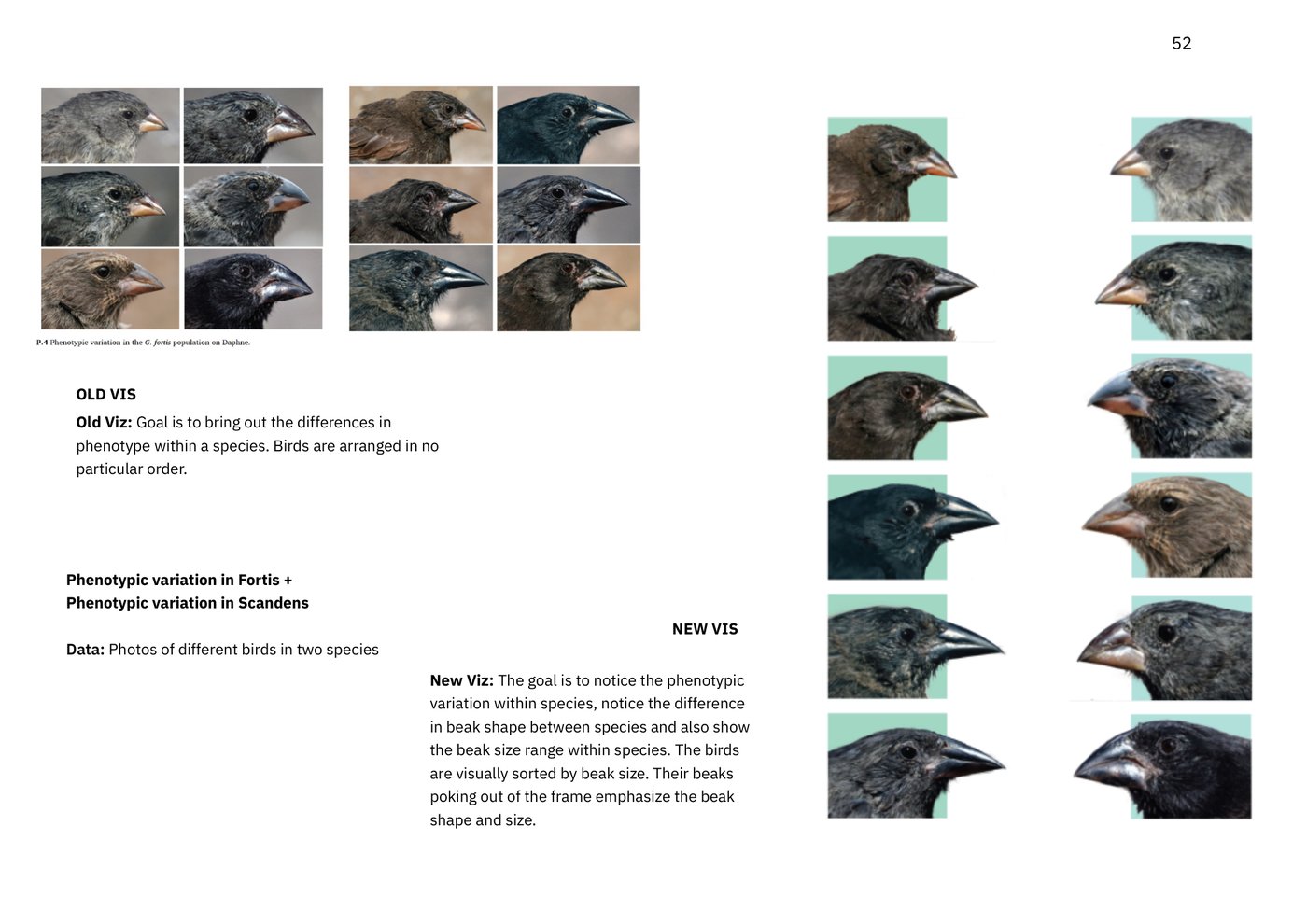
Variation within a species. Old: a photo grid in no particular order. New: sorted by beak size, beaks breaking the frame so the shape is the first thing you see.
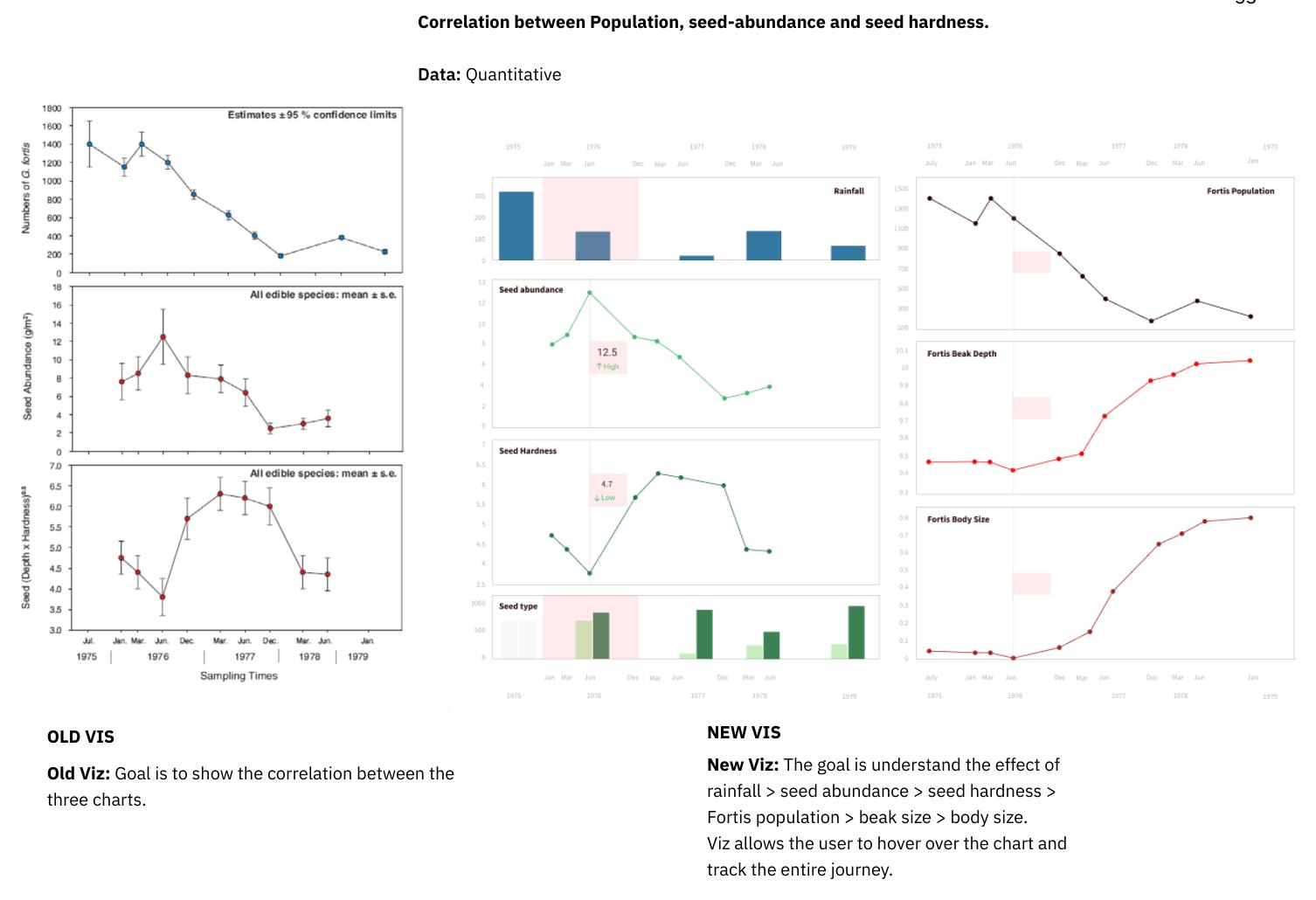
Cause and effect, 1975 to 79. Old: three juxtaposed charts. New: linked panels with a shared time band, so hovering tracks rainfall to seeds to hardness to population to beak to body in one motion.
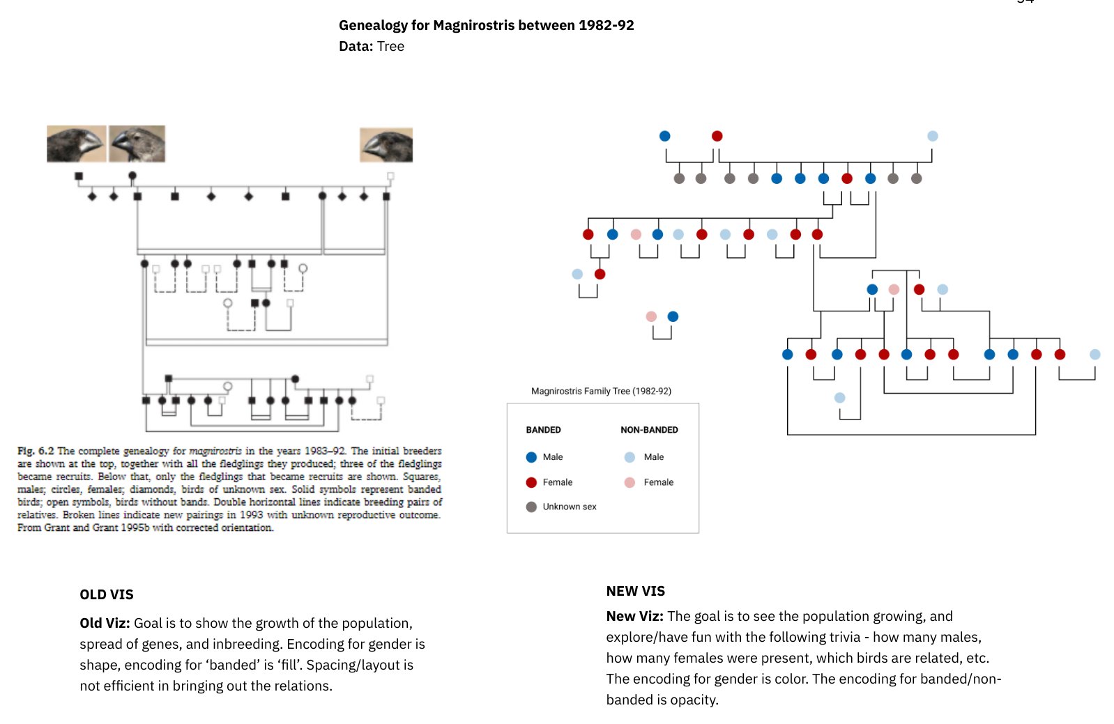
The magnirostris family tree, 1982 to 92. Colour for sex, opacity for banded or not, laid out so the population is seen growing and a reader can count males, females and relatives for fun.
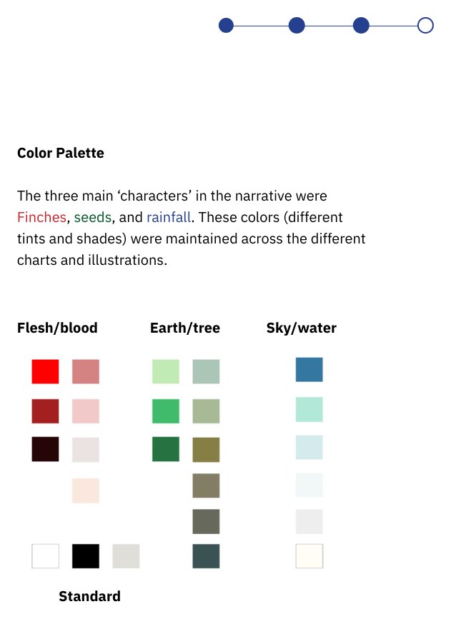
Three characters, three palettes, held constant across every chart and illustration.
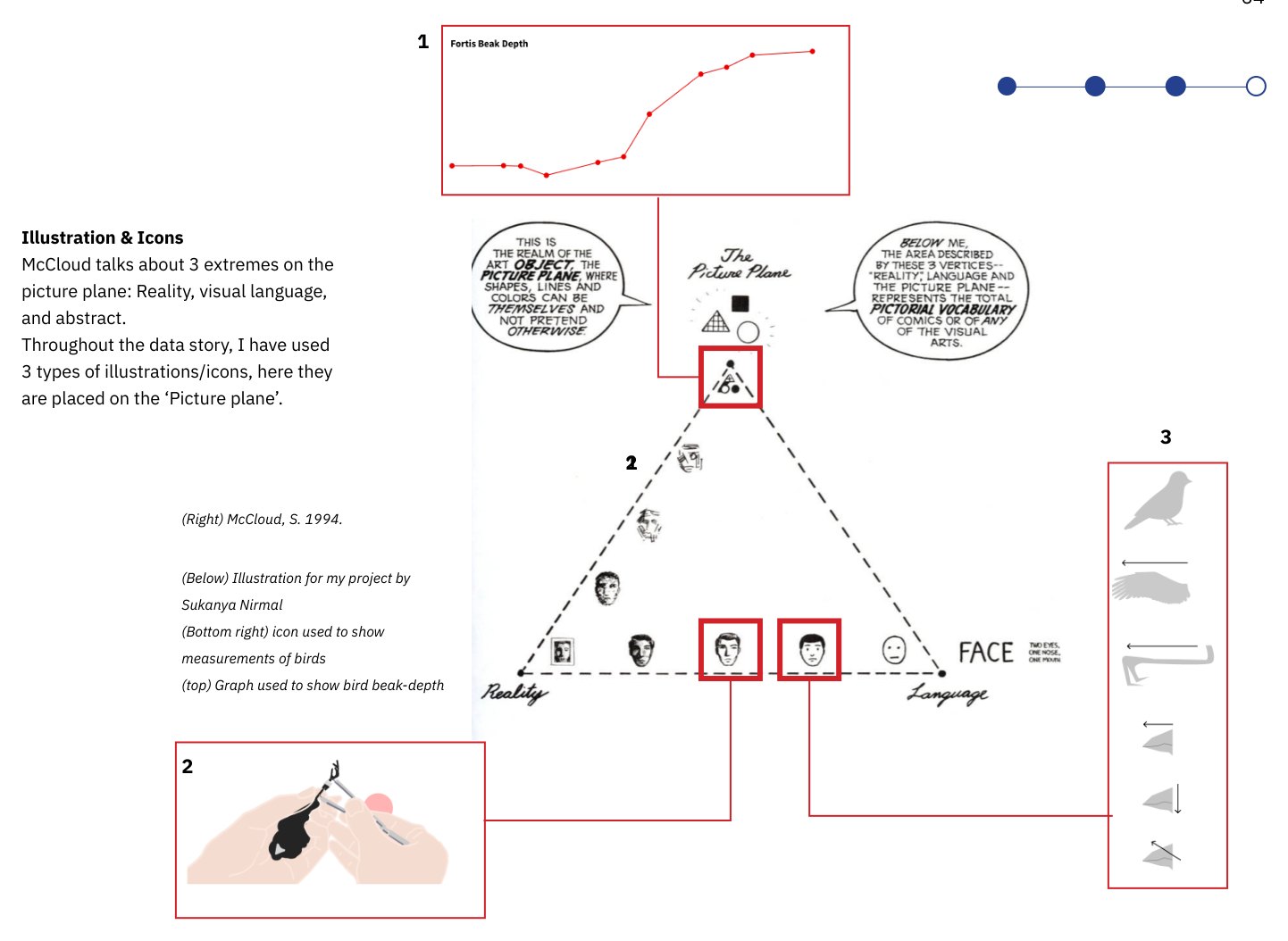
Three kinds of image, each placed deliberately on McCloud's picture plane.
What it became
A linear story that opens with Darwin's idea, introduces the Grants, Daphne Major and the four finches, then lets the timeline carry the reader from 20,000 years ago to 2012 and closes on why evolution matters in 2020. Navigation is deliberately plain: back, forward, and the timeline itself.
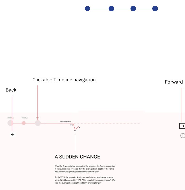
The navigation, annotated.
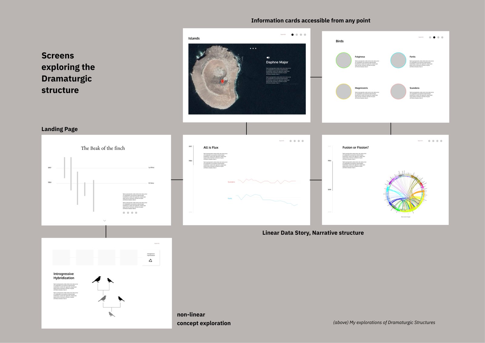
Where it started: the Phase 1 screens for the hybrid structure, before the timeline took over.
What testing showed
Two readers with different habits went through the prototype first; I sent it to about six more and observed them.
The reluctant reader
Found the text jargon-heavy and hard to follow; wanted the hover interactions; asked for something more interesting than bar charts.
The focused reader
Read it all, called the writing professional, wanted it shorter and more dramatic.
Everyone paused at the illustrations
The hand-drawn measuring sequence held attention longest.
Nobody noticed the timeline
Drawn too light. The piece's central device was invisible.
Pages were missed
People did not scroll intuitively; the screen never told them there was more below.
Type too small
Timeline and labels needed to be bigger; hierarchy needed to be clearer.
What building it exposed
Designed at 1440×1024; on smaller laptops the bottom of every screen was cut off.
What I changed
Trial and error down to 1440×800, which worked on every tester's device.
Lesson
Test on the worst screen you can find, early.
What building it exposed
The whole interaction was meant to be scroll-driven. Figma does not recognise scroll as a trigger.
What I changed
Replaced scrolling with back and forward navigation and a clickable timeline.
Lesson
The tool constrained the idiom. The novelty the jury wanted was possible, but only in code.
Against the criteria
- Clarity: mixed. One reader followed it end to end; one found it jargon-heavy despite the writing rules. Both wanted it shorter. I planned cuts and a clearer hierarchy for 26 December.
- Understanding of subject and domain: the dataset survey, the four redesigns and the caught superimposition error are the evidence; the genetics chapters stayed out of scope by decision.
- Process: data-first via Munzner, McCloud's six steps for the design, documented at each step.
- Aesthetic usability: "very nice to look at, but the interaction could be more polished." The timeline and type were too light and too small, and I knew it before submission.
The reader test, for the final jury
After submission I ran the test the report had only scheduled: a pre-test to record interest and initial understanding, a read of the data story, and a post-test on whether definitions had changed, how clear it was, and what stuck. The prototype was judged on four criteria: clarity of concepts and visualisations, increase in knowledge, interest and memorability, and aesthetic usability.
Readers
12General audience, pre-test then read then post-test
Interested going in
10 of 12
Clarity, 1 to 10
All 12 scored it 7 or above8 of 12 gave an 8 or a 9; 2 gave a 10
The writing
8 interesting, 2 enjoyable1 too detailed, 1 difficult to understand
The visualisations
5 enjoyable, 4 interesting1 average, 1 "clean and scientific", 1 interesting but the interactivity was difficult
- Knowledge: readers said the difference between evolution and natural selection, and between fitness and natural selection, was clearer afterwards, and that real data gave real-world understanding. New to them: character release and displacement, that evolution happens in short spans of time, and how small changes make a big difference in survival.
- Memorability: everyone could recall some of the important concepts when asked to summarise the story or list keywords.
- What readers appreciated: difficult concepts and experiments made easier to understand; a smooth narrative flow; renewed interest in the topic.
- What they did not: the birds' names were hard to remember; readers did not remember to hover and missed information; navigation was annoying because they could not easily go back to earlier concepts.
What I took from it: the navigation and interactivity need to improve, the visualisations should carry more of the weight and the text less, the typography should make the text more dynamic, and the palette needs to work for colour-blind readers.
What I would do differently
"One of the greatest challenges was to let go of many interesting facts and details, and ruthlessly scope down the content for the sake of simplicity and flow."
Build it in code. Figma limited the idiom to what could be clicked, and the scroll-driven read I designed for never existed. And run the reader test before the report, not after it: the piece's whole claim is that a general reader comes away understanding something, and the test that showed they did happened between submission and the jury, too late to change the piece.